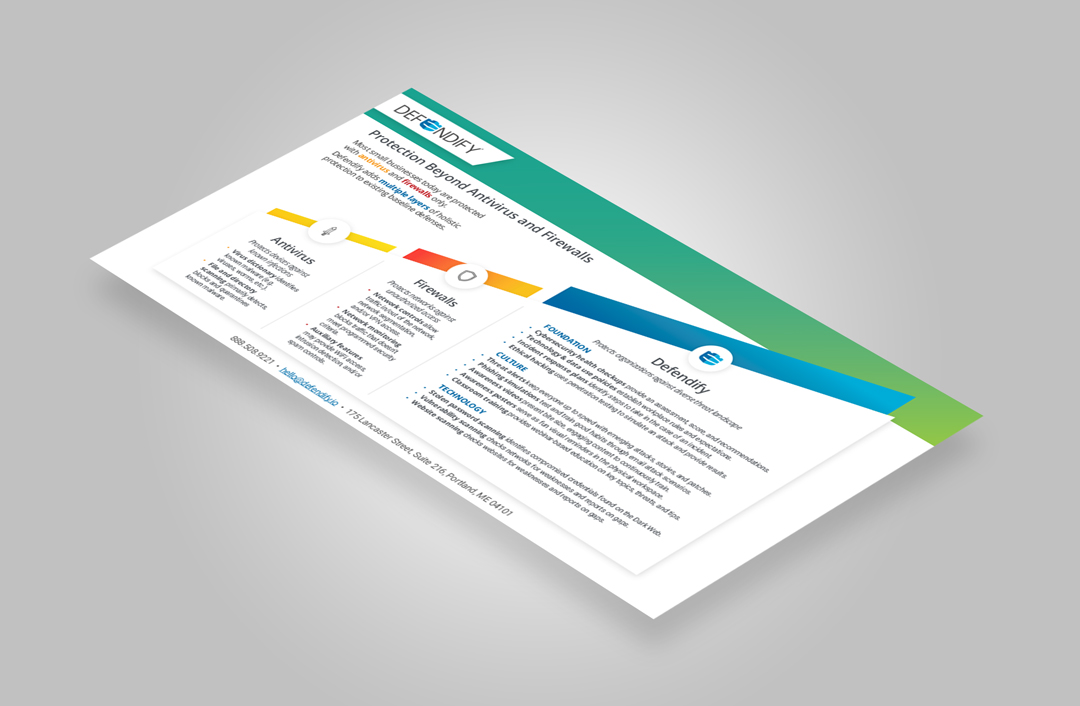
Defendify’s core is defined by three simple, but crucial layers that when combined create a powerful barrier against all cyber threats:
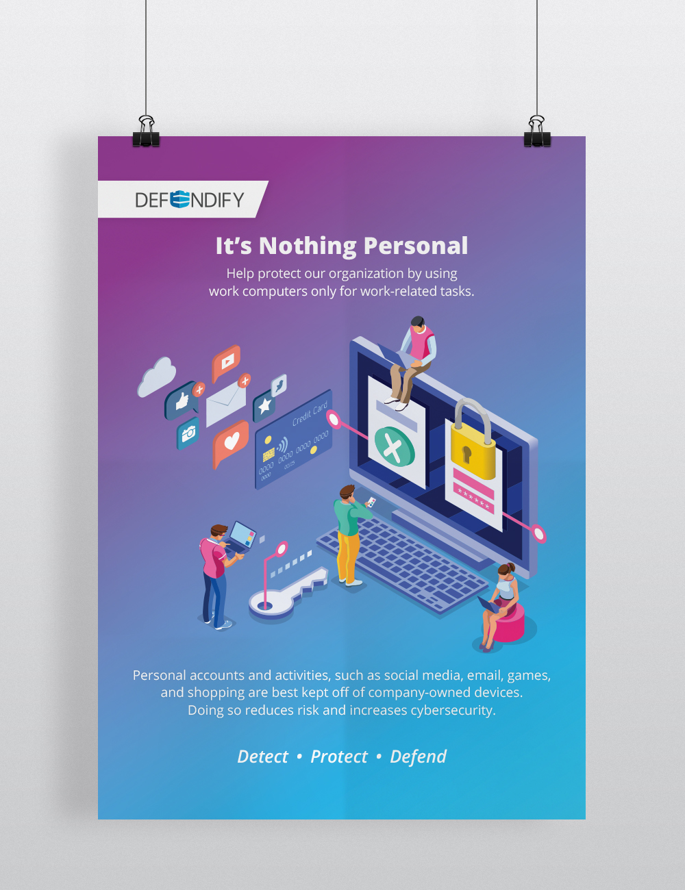
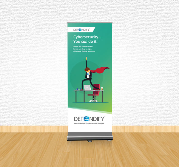
Cybersecurity. Simplified.
Brand Pillars
- Foundation of policies, procedures, and plans.
- Culture of employee awareness and institutional knowledge.
- Technology that goes beyond traditional antivirus and firewalls.
Core Focus
Defendify is about taking the headache out of managing cybersecurity and making it affordable by engaging with organizations who don’t have the resources to stay on top of their security needs.
Common characteristics of the Defendify audience:
- Possibly tech savvy, but not necessarily experts
- Concerned about costs, operations, and protection of intellectual property and data
- Have inadequate or outdated cybersecurity solutions
- Have proper cybersecurity in place, but are over-burdened with managing it all
- May be subject to compliance and/or regulations
- Work in any industry sector requiring computers and data
- Confused about the term cybersecurity and looking for clarity and guidance
- Are unaware of or do not understand the risks and consequences
of a cybersecurity incident - Confused about what cyber insurance covers and how it relates
to cybersecurity
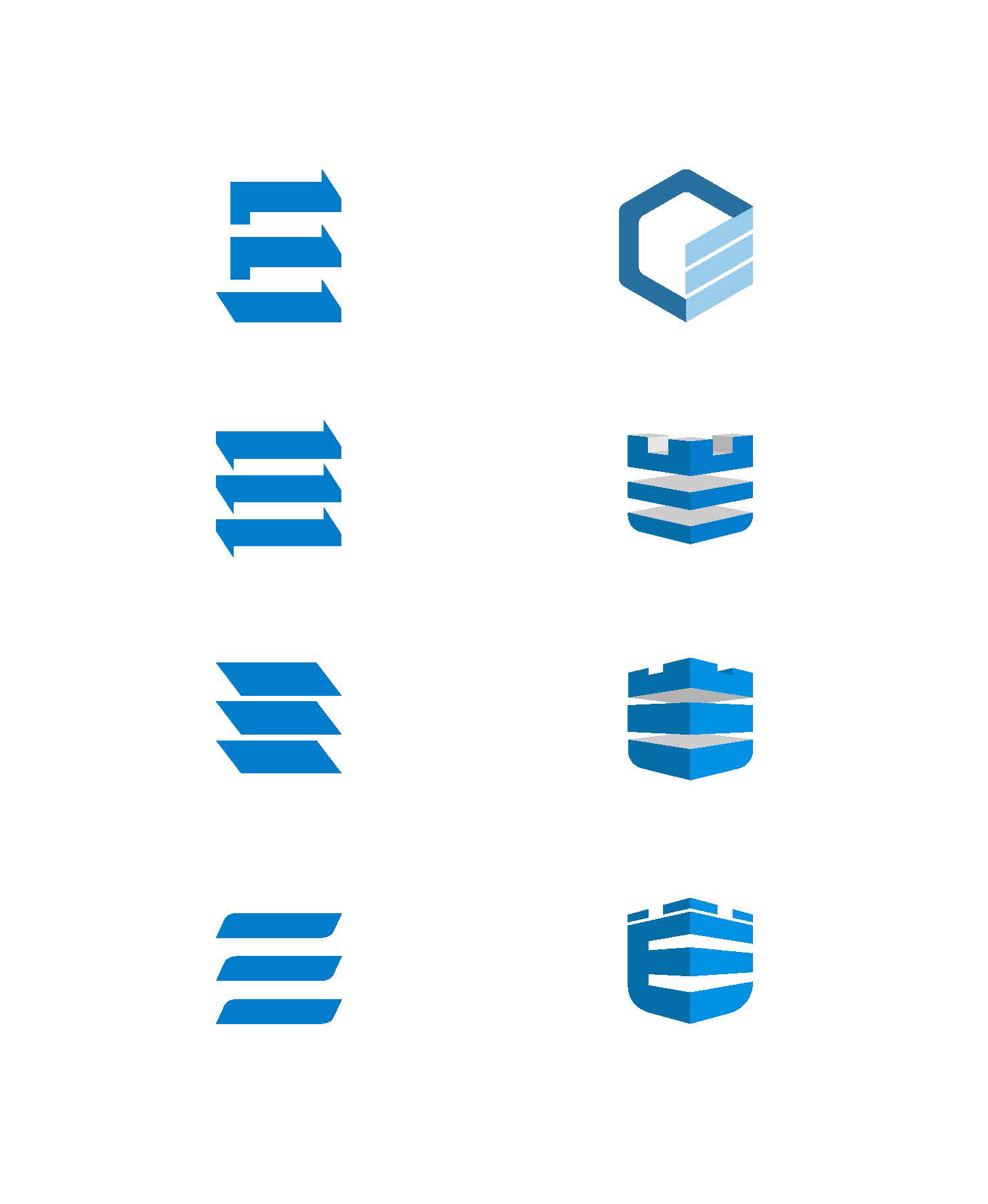
The Logo
A distinction
The Defendify logo uses a combination of both letters and symbols to represent the brand. The letter “E“ is replaced by a bespoke symbol that makes the logomark distinct and unique.
- Rounded bottom corners suggests a silhouette of a shield
- The icons’ similarities to a rampart or medieval helmet suggests timeless and impenetrable level of defense
- Two point perspective speaks of past and future; direction
- Light source is placed on the right side alluding to the future
- The three-tiers echoes company philosophy of Foundation, Technology, and Culture
The Logo
Concepts and iterations
Various versions were explored to identify the ideal representation of the original core values and the company’s overall mission statement.
- Exploration of negative spaces
- Incorporating server blades/racks
- Consideration of a rudimentary isometric cube design
- A two point perspective was finally introduced to not only put both the viewer and the brand on the same level, but also to give a sense of a shared horizon; a common goal
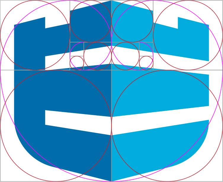
The Logo
The Refinement
A mirrored golden ratio was utilized to refine parts of the logo, which ultimately led to the discovery of intersecting points, proportions, relationships between shapes, and finally alignment.
- Four corners intersect within the main ratio
- Rule of two-thirds was applied
Colors
Light Blue
#00acd8
Dark Blue
#0069a7
Dark Gray
#4a4f54
Orange
#e66821
Fonts
Open Sans
A B C D E F G H I J K L M N O P Q R S T U V W X Y Z
a b c d e f g h i j k l m n o p q r s t u v w x y z
Roboto


